


If you need to furnish your professional activity, here is a space dedicated to you.
A color linked par excellence to nature, green is increasingly used and appreciated in home furnishings. Since 2017, when Pantone chose Greenery as the color of the year, it has never gone out of fashion and, indeed, there are those who argue that it will be the color of this decade. Its countless gradations make it a versatile color in the field of space design, where its use and meaning change based on the chosen color range. In this article we offer you five types of greenery to use at home or in outdoor furnishings and the combinations recommended by our interior designers.
In the textile and artistic fields, green was originally produced with pigments extracted from plants. Being mostly derived from vegetables and consequently chemically unstable, these colors changed easily over time and depending on environmental conditions, taking on a washed-out appearance. Due to this changeable nature, until the Romantic era the color green was associated with luck, (bad) luck and unpredictability. The connection with nature and positive sensations is relatively late, establishing itself only in the second half of the 19th century. Today light green is synonymous with freshness or growth, while dark green in forest or aqua shades recalls peace and tranquility.

Depending on the shades chosen, green evokes different sensations, therefore it is necessary to evaluate which shade is most suitable based on the environment to be furnished. We have chosen for you five color ranges and as many green tones that will guide our furnishing suggestions.
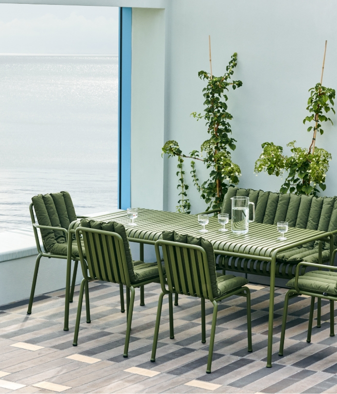
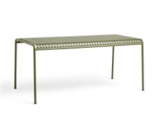
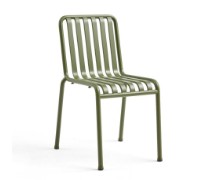
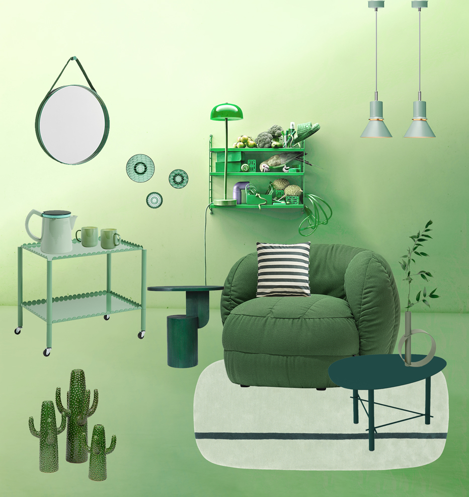
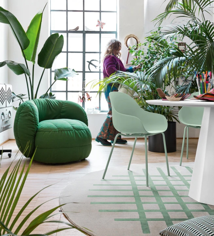
Natural colors represent a passe-partout for those who want to include green in a furnishing project. The most interesting shades are inspired by the colors of nature: olive, fern, rosemary, avocado, agave: we suggest you choose a predominant one and combine it with neutral shades such as white, ivory, gray or beige. The effect will be elegant and bright, particularly in indoor environments. Those who need to furnish an outdoor space and want to enhance the connection with nature can opt for a color palette reduced to a minimum: tone-on-tone chairs and tables to combine with plants, flowers and construction elements of the house, such as natural wood or concrete.
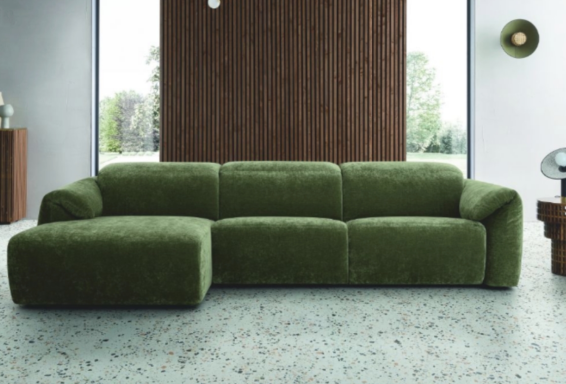
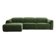
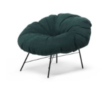
Due to their ability to create a calm atmosphere, dark shades such as forest green or petrol are suitable for the living area or bedroom. We recommend these gradations to those who want to stimulate a better balance between body and mind, particularly in rooms where you dedicate yourself to relaxation or rest. A sofa with soft shapes and a moss green covering will be perfect combined with dark wood furnishing accessories or gold-colored details. For the bedroom, a teal-colored upholstered bed pairs well with natural wood elements, blue details and dimmable lamps. The idea is to create a restful context, which evokes the atmosphere of the woods or a countryside environment.
Bright and therefore capable of expanding the internal space of the rooms, the shades of light green are soothing and at the same time revitalizing. Our interior designers recommend them above all to those who need to furnish an open space, the dining room or work spaces: environments in which we usually spend a lot of time and in which we must feel good. Among the light tones, sage green is one of the most popular in recent years: it is found in particular in the Nordic style, where it is often used combined with natural oak, white and shades of blue.
By classic shades of green we especially mean the "pure" ones, composed of yellow and cyan. They are colors with a strong character, to be used carefully in furnishings unless you want to dare boldly. Flag green, emerald or turquoise are frequently used for complements and accessories, but nothing prevents you from choosing them for more important furnishing elements. If you like pop-inspired color palettes, dare with creative and very trendy combinations in this period: emerald with electric blue or black, flag green and marshmallow pink, turquoise green and gold, yellow or burgundy.
The children's room, the study and the small accessories are well suited for energizing touches of color, which can be chosen to give a boost to the furnishings. The advice is to identify a guide shade and not to exceed with other colors to avoid an all too easy Harlequin effect, unless this is exactly what you want. Acid green, apple color, or lime tone down well alongside neutral shades such as natural wood, white and beige. However, if your intent is to be daring, you could combine pink, purple, sunflower yellow or orange for the accessories.
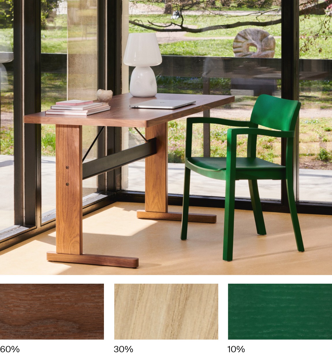
Widely used in interior design, the 60-30-10 rule can help in choosing colors to match the greenery in your home. It is a principle that can naturally be applied to any color range, because it is based on three simple indications:
1. Inside the room to be furnished, 60% of the space is occupied by the main colour: e.g. floor, walls, construction elements.
2. Next to it, for the larger furnishing elements (e.g. sofa, carpet, table) the secondary color is identified, which will occupy 30% of the space.
3. Finally, for the remaining 10% you choose an "accent" color, i.e. the one that will give originality and character to the room. This will be the color of accessories, complements and other details.
Keeping these general indications in mind, you could choose green as a secondary color (30%) in the case of natural or dark shades, to be combined for example with gold-coloured details (10%), for a more classic color palette, or in cognac or black leather for an industrial-inspired style.
If, however, you love stronger shades, you could choose bottle green, pistachio or peacock as an "accent" color (10%), to be combined with softer shades for the rest of the furnishings.
If you need to furnish your professional activity, here is a space dedicated to you.
 Belgium
 Bulgaria
 Croatia
 Czech Republic
 Denmark
 Deutschland
 España
 Finland
 France
 Greece
 Hungary
 Ireland
 Italia
 Luxembourg
 Netherlands
 Österreich
 Poland
 Portugal
 Romania
 Slovakia
 Slovenia
 Sweden
 italiano
 english
 français
 deutsch
 español